
- Branding
- Design
Design for Loving
The brief
Overview
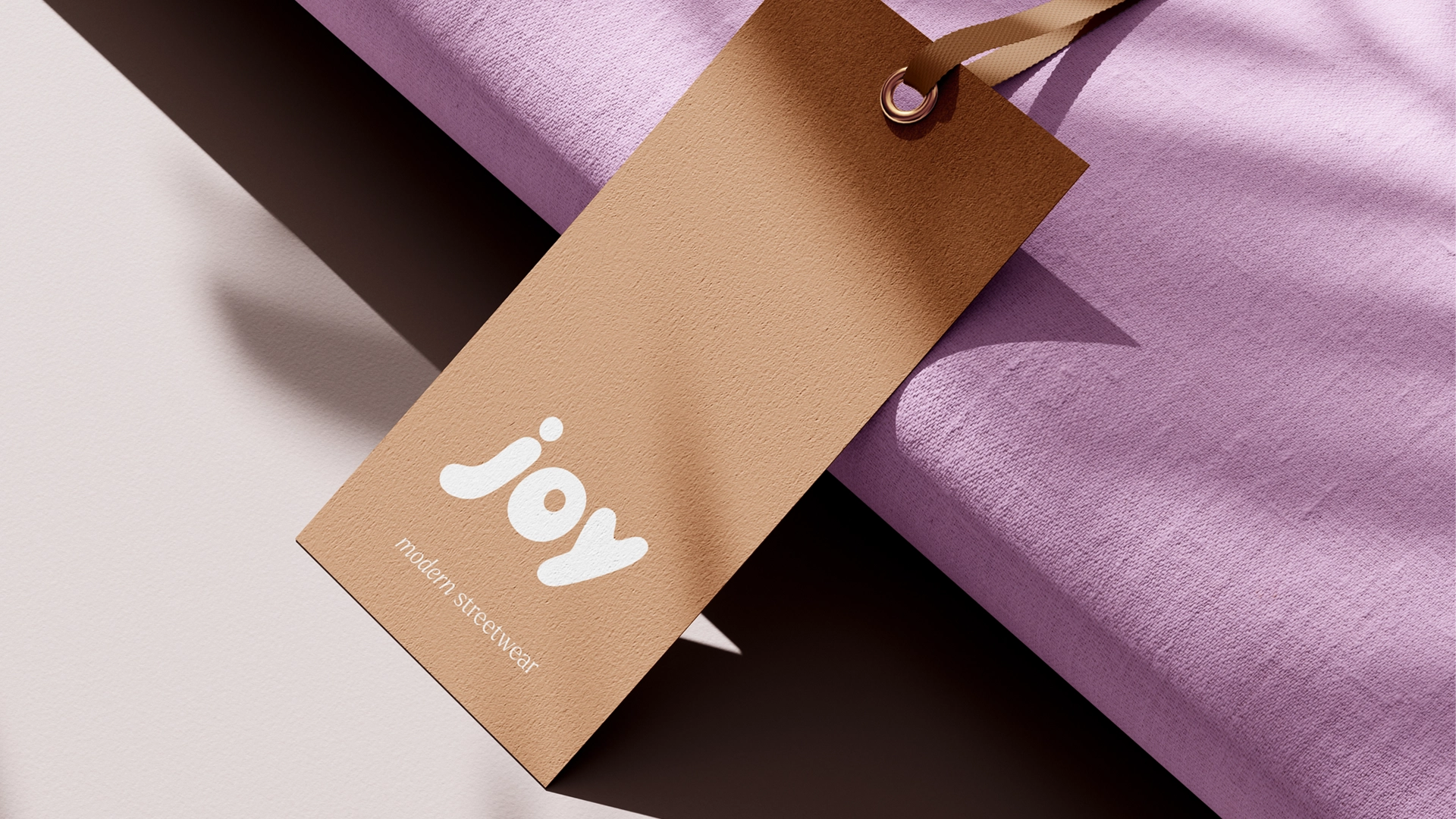
Joy came to us for a logo for her apparel brand, one that felt warm, kind and approachable. The brand carries a purpose behind it: raising awareness for mental illness, and inspiring hope and kindness in a wide audience.
That purpose set the brief. The mark had to feel simple, nostalgic and calming, and it had to connect broadly rather than to one narrow taste. Warmth wasn't a nice-to-have here. It was the whole point.
The approach
Our approach
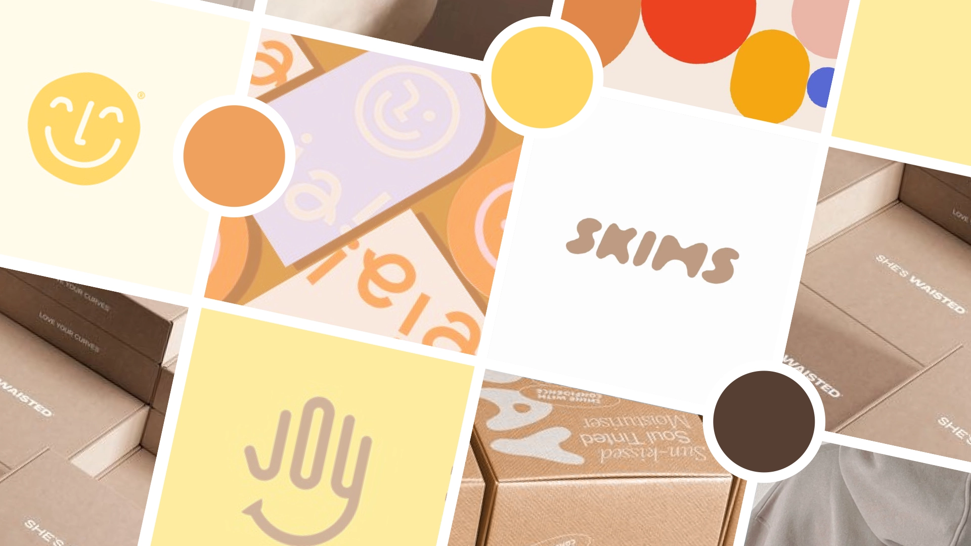
We started with a mood board aimed at a playful, relaxed feel: bubble-inspired type and a warm palette that read like sunshine. Once that direction was agreed, we developed logo concepts that carried Joy's values of warmth and approachability through every choice.
The result
The outcome
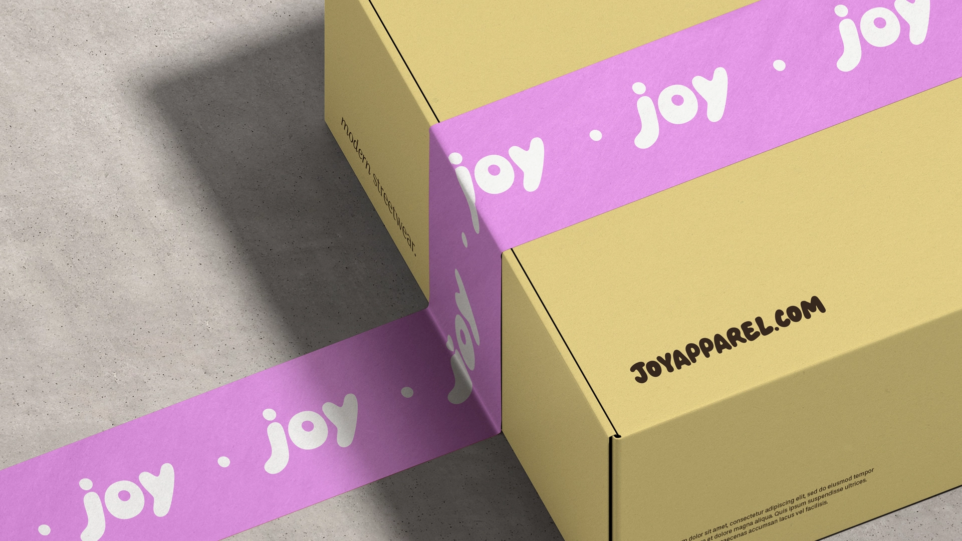
The final logo uses a bubble-inspired font with soft, rounded edges, paired with warm, calming colours. Together they land the feeling of ease and optimism the brand was after: a friendly, simple identity that carries a meaningful message and leaves a positive impression.